Skrybe Brand Identity
Skrybe Brand Identity
Skrybe Brand Identity
Overview
Overview
Skrybe is an electronic documentation & archiving company that aims to competewith global tech brands like Google drive, Dropbox and Microsoft onedrive.
The company’s core values are professionalism, privacy, competence and its brand purpose is to remove the burden of safely archiving information from people and organisations
The objective was to create a brand identity that communicates confidence, security, trust, professionalism, and technology.
Project Scope
Project Scope
Brand Design and Identity Guidelines
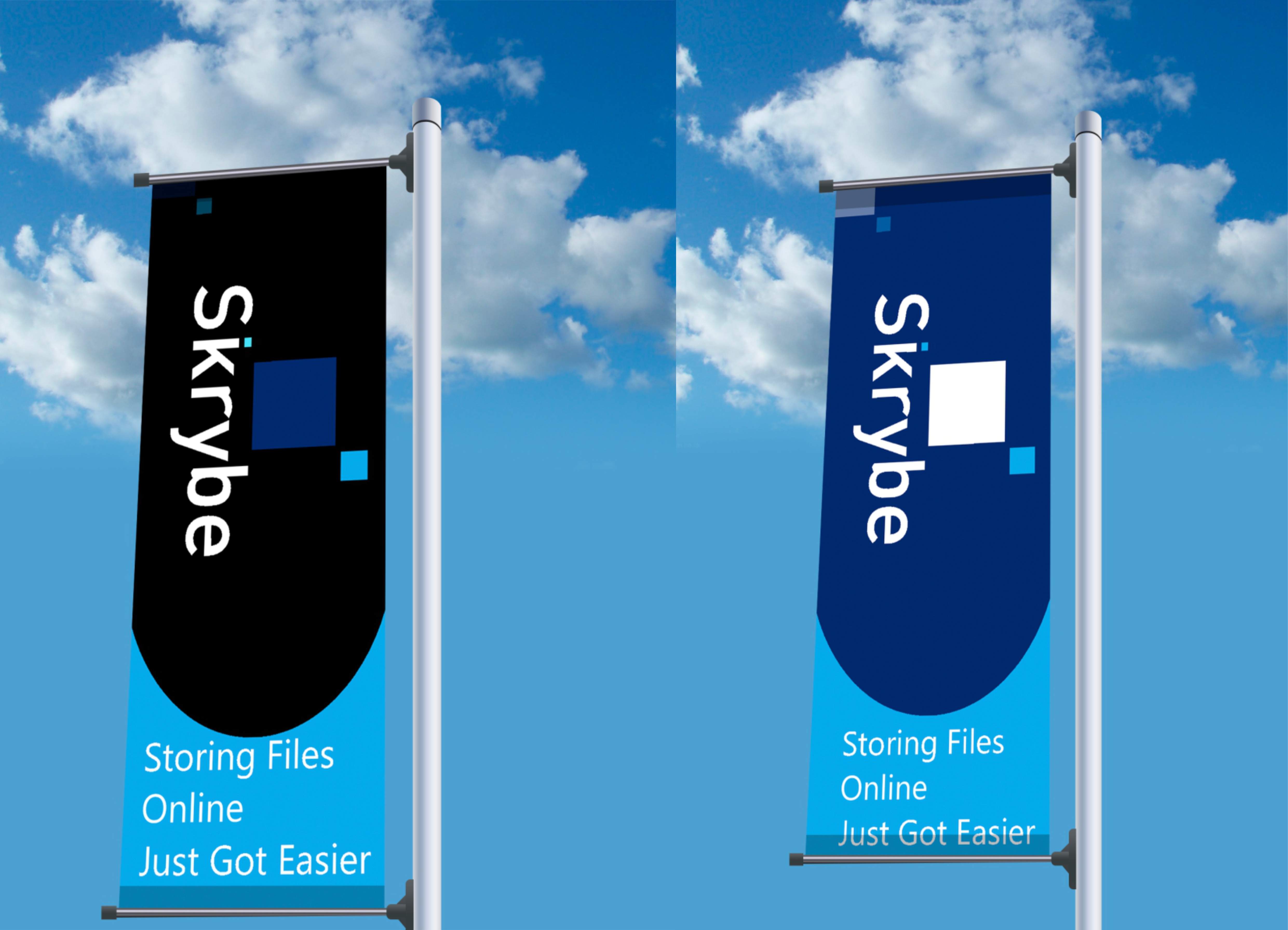
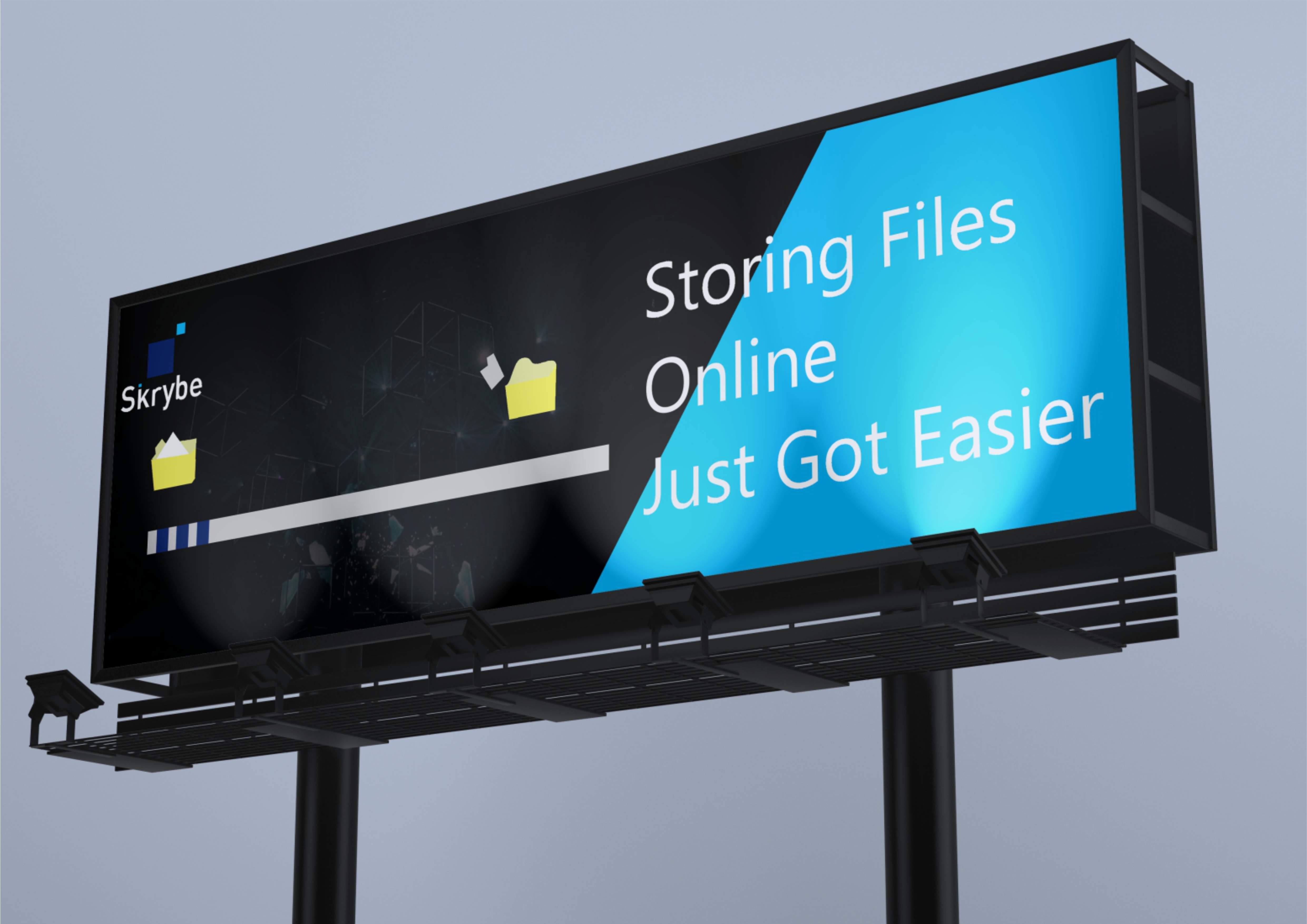
OOH Advertising
Motion Graphics
Copywriting
Logo Rationale
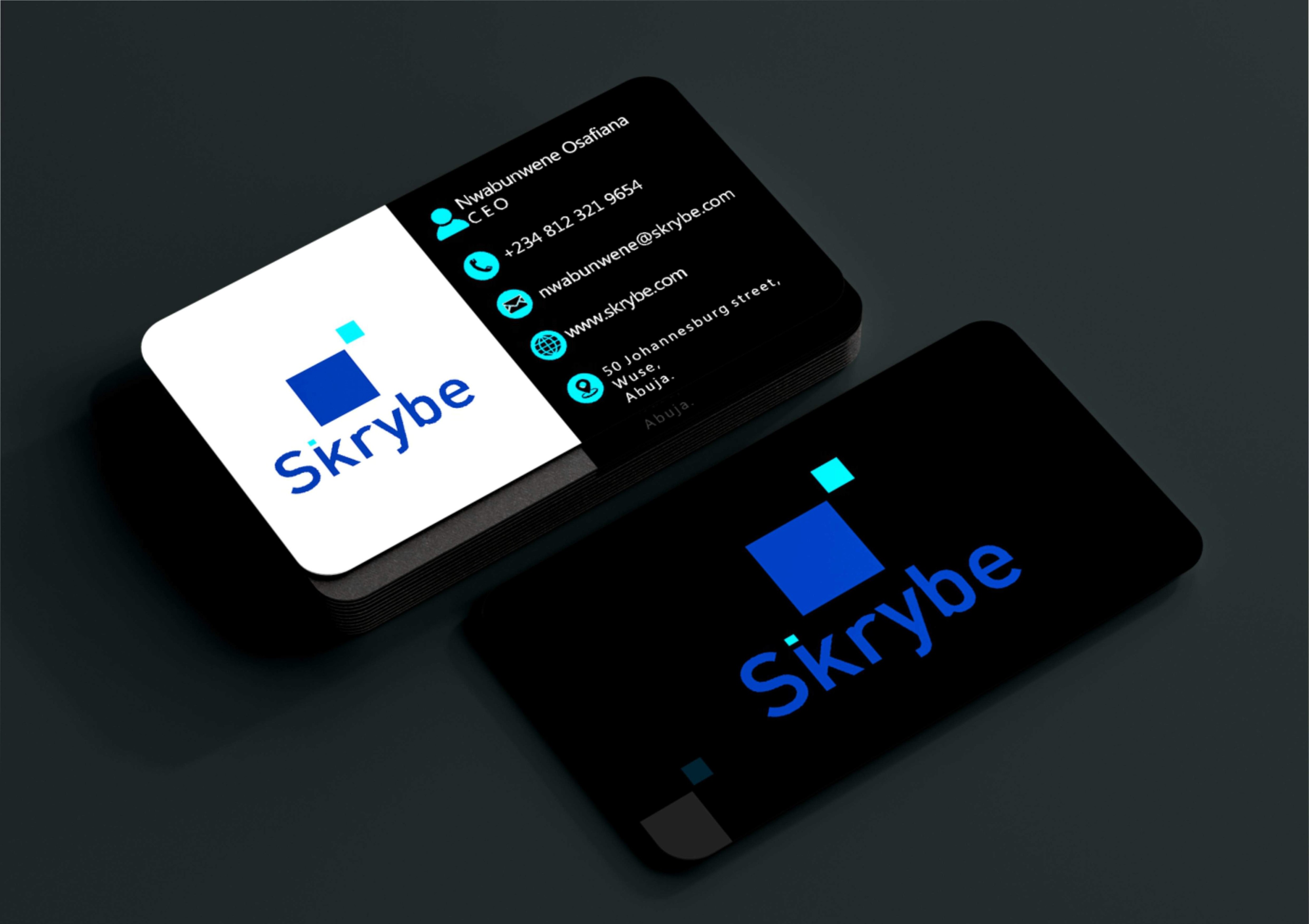
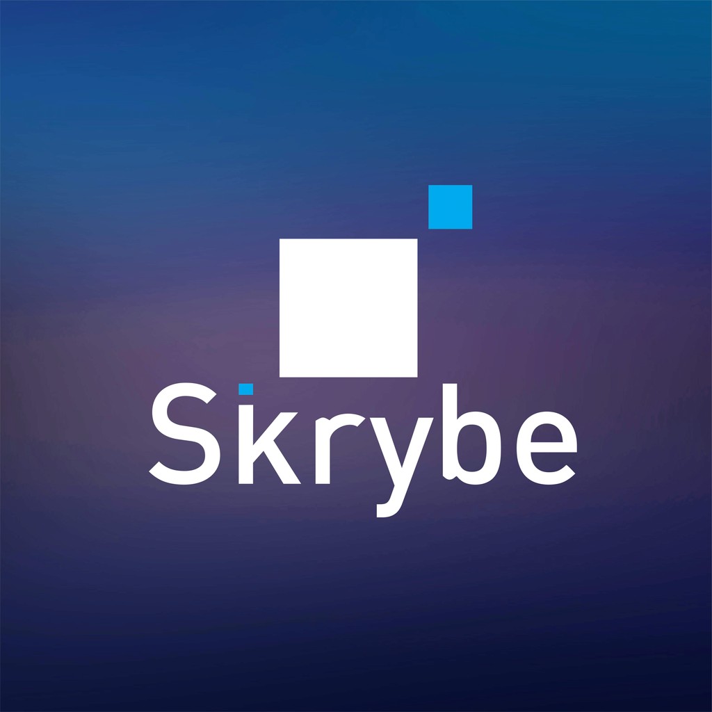
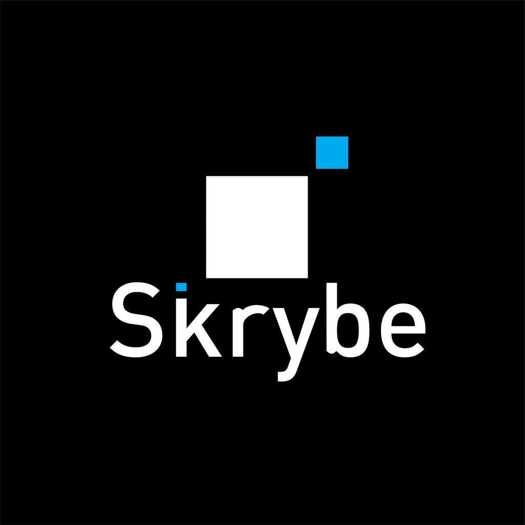
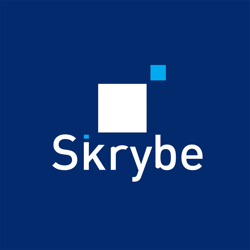
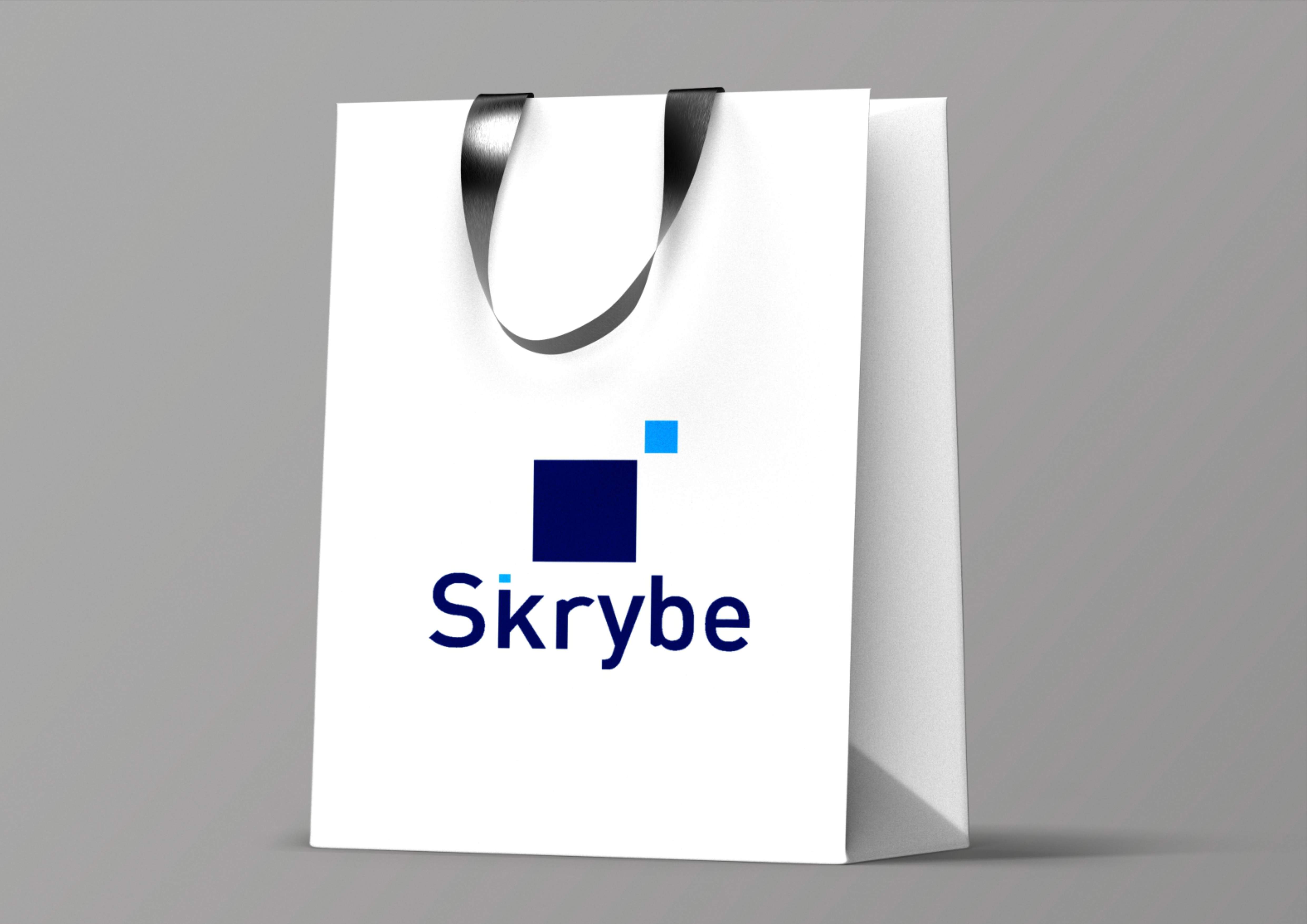
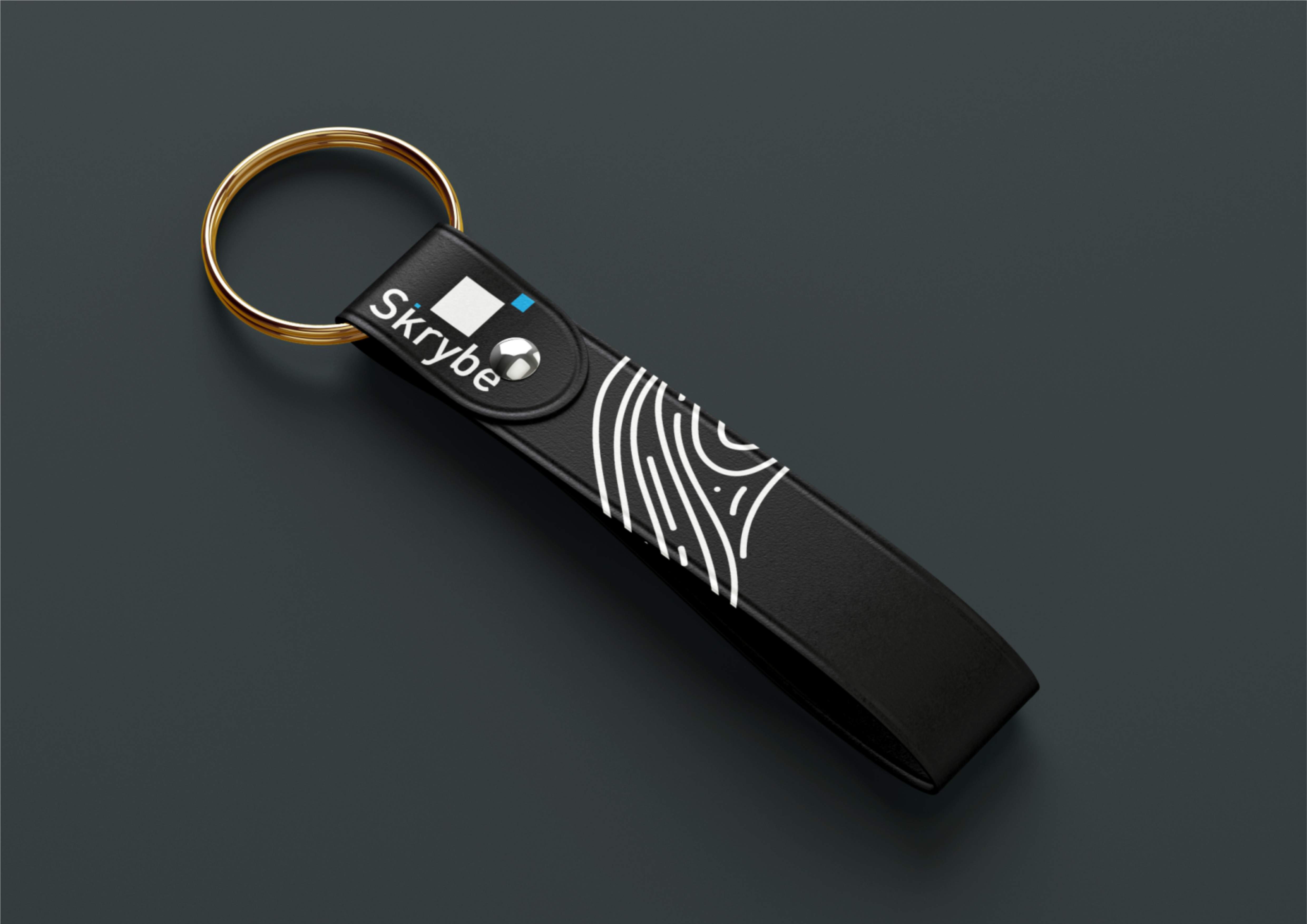
The logo icon consists of two squares with different dimensions.
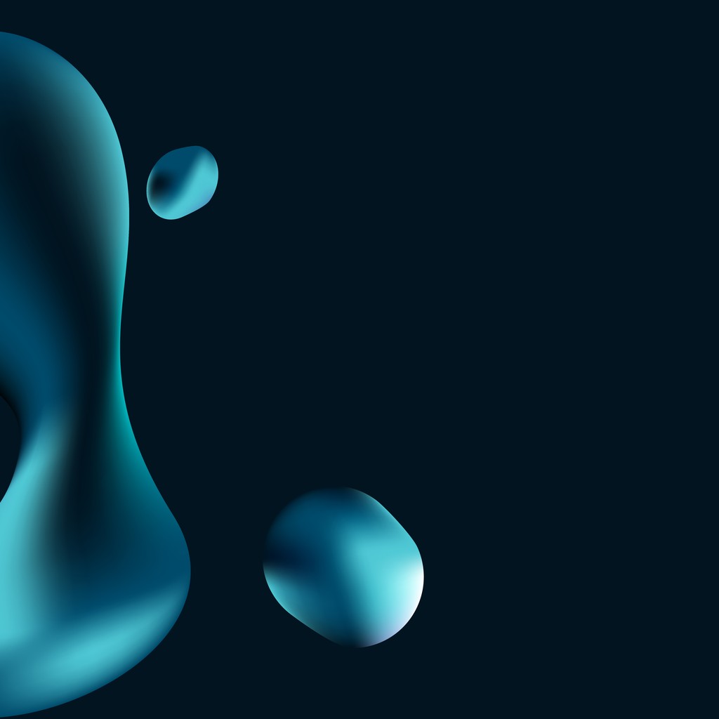
Squares are familiar, dependable shapes , their straight lines and 90-degree angles naturally evoke a sense of strength, security, and stability. This visual language aligns with the brand’s purpose: providing clients with a sense of security and relief.
The logo is also inspired by the movement of files being transferred between two parties, reinforcing the idea of safe, seamless communication.
The typeface used is a sans-serif font that has been subtly customized to enhance uniqueness and character.
Additionally, a smaller square has been integrated into the text to create visual repetition, reinforcing the brand message across both the icon and typography.
The logo icon consists of two squares with different dimensions.
Squares are familiar, dependable shapes , their straight lines and 90-degree angles naturally evoke a sense of strength, security, and stability. This visual language aligns with the brand’s purpose: providing clients with a sense of security and relief.
The logo is also inspired by the movement of files being transferred between two parties, reinforcing the idea of safe, seamless communication.
The typeface used is a sans-serif font that has been subtly customized to enhance uniqueness and character.
Additionally, a smaller square has been integrated into the text to create visual repetition, reinforcing the brand message across both the icon and typography.
Logo Rationale
The logo icon consists of two squares with different dimensions.
Squares are familiar, dependable shapes , their straight lines and 90-degree angles naturally evoke a sense of strength, security, and stability. This visual language aligns with the brand’s purpose: providing clients with a sense of security and relief.
The logo is also inspired by the movement of files being transferred between two parties, reinforcing the idea of safe, seamless communication.
The typeface used is a sans-serif font that has been subtly customized to enhance uniqueness and character.
Additionally, a smaller square has been integrated into the text to create visual repetition, reinforcing the brand message across both the icon and typography.
Good Ideas Deserve Great Design
I collaborate with brands, startups, and teams to turn concepts into clean, thoughtful visuals that connect and inspire. If you’re building something meaningful, let’s make it look as good as it is.
Good Ideas Deserve Great Design
I collaborate with brands, startups, and teams to turn concepts into clean, thoughtful visuals that connect and inspire. If you’re building something meaningful, let’s make it look as good as it is.